The Branding Workshop
MinkoImages set up a branding workshop to help the client redefine and realign the brand's mission and vision. The main challenge was to connect training, the core service provided
by the company, to the notion of learning, a collaborative engagement with their target audience.. It offered a viable bridge between internal success and the success of those in need of training. In the process, the vital importance of that connection became evident and was completely adopted as a conceptual framework for the new brand mark.
The success of this approach became evident when the client team developed an understanding of the branding process by directly shaping it.
The Challenge
Once the organic connection between training and learning was established, MinkoImages turned it into a visual success story. Learning is a state of constant becoming, and training how to learn is the condition for improving. Leadership was redefined in the transforming force of deliberate change.
The visual elements tell the story of a single letter "t" that transforms into an "a." It spells the acronym of the company's name, TTA, showing how repetition leads to innovation.

Very often, well-run businesses rely too much on the fact
that they know what they are doing and take for granted communicating it to the public. In this case, a generic and
dated visual brand mark, shown on the left, fell short of representing a leader in the L&D space. The lack of a coherent visual identity system and style did not support a stable and established company presence in the marketplace. Such misalignment between substance and appearance required reframing of the message and crafting of brand attributes
that met the aspirations of target audiences.
The Visual Language
Case Studies
TTA | re-branding a leader
Beautiful design is nothing but what happens inevitably when you set the necessary conditions
What our client said
about our work
After unveiling of the new visual identity and logo, we received so many compliments from our clients and prospects. In fact, when we were recently exhibiting at the DevLearn conference in Las Vegas, so many people came up to our booth to share how much they liked our new visual identity and logo - and this is so rare to get this type of feedback.
Minko led fun and engaging workshops with our employees to listen and understand what attributes truly represent our brand. After just a few weeks of anticipation he delivered a creative masterpiece. He was able to brilliantly capture our story with just ONE letter...using forward movement , repetition and transformation! Most companies add images, symbols etc. to create their visual identity.
President and CE0 at TTA
★★★★★
★★★★★
Jasmine Martirossian
VP Marketing at TTA
TÜV SÜD | boosting internal brand buy-in
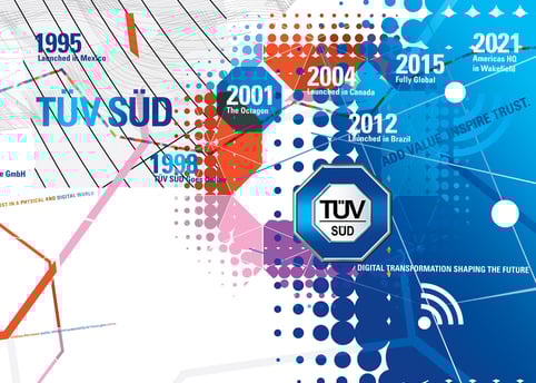
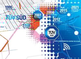
More Than a Timeline
MinkoImages processed the client's history visually and turned it into a dynamic graphics display. The immersive art reflected the key milestones in the timeline and exploded it in color and shapes, defying linearity and introducing a depth of experience stretching from the early days of the Industrial Revolution
to our Digital Age. Key brand elements were featured and interpreted visually for a consistent brand style. However,
the visual language expanded the impact well beyond mere compliance with stylistic requirements into a vivid brand dress.
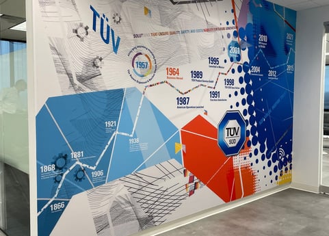
The Challenge
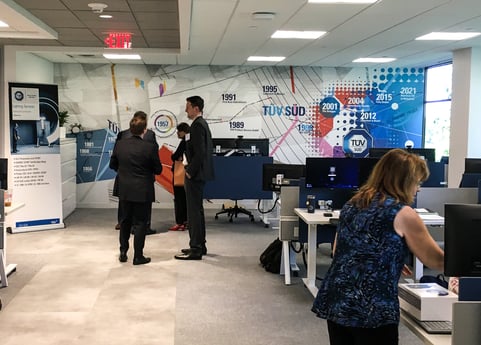
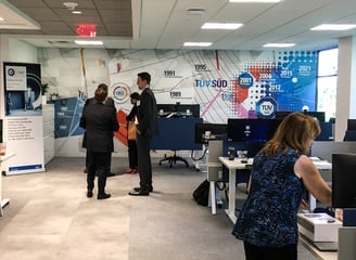
Turning a space into a place is a challenge that MinkoImages met by exceeding the client's expectations. The environmental brand graphics wall became the highlight at the grand opening of the new TÜV SÜD America headquarters in Wakefield, MA. Employees took selfies in front of the wall—a perfect test for the effectiveness of the design.
Soon after the installation, other offices requested similar artwork. TÜV SÜD GRC in NJ, Environmental Testing Lab in Auburn Hills, MI, and the Testing Lab in New Brighton, MN, celebrated their new office spaces by installing our work.

Big international brands like TÜV SÜD owe their success in no small measure to internal brand buy-in. Aside from the pride and the sense of belonging to a success story, which motivates internal audiences, employer branding can increase talent retention by as much as 28% and can even reduce new hire costs by 50%. (LinkedIn) Since COVID, office environments
have been under pressure. A workplace can motivate people and brand visual attributes work beyond the mere look and
feel consistency. The emotional bond of artistic interpretation of important branding themes works both ways—inwards
and outwards.
When TÜV SÜD expanded to the U.S., Americans became part of one of the greatest German brands with a rich history and global reach. MinkoImages was charged with the task of communicating the TÜV SÜD success story through large environmental graphic displays located in offices across the U.S.
The Brandplace
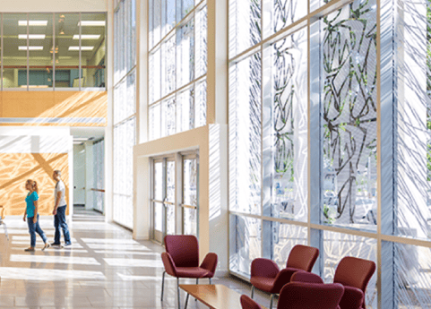
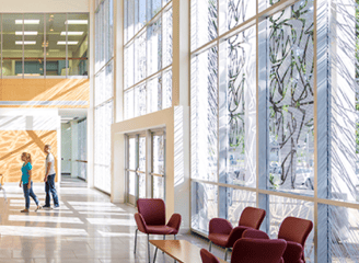
Lee Davis Library | rebranding a college library
into a community center.
The Challenge
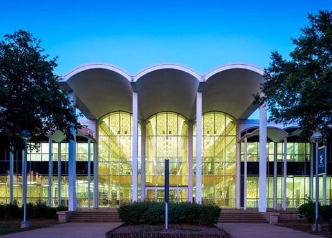
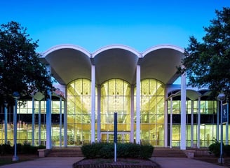
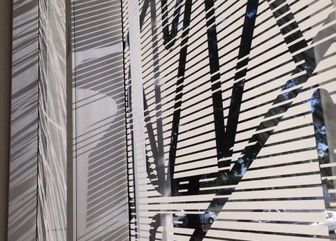
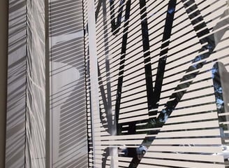
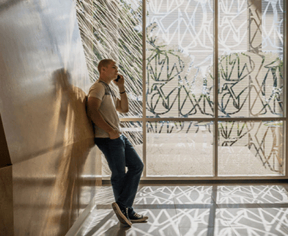
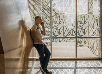
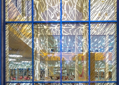
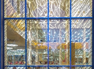
When Gensler Houston renovated The Lee Davis Library at San Jacinto College in Texas, preserving the midcentury style of the iconic building drove the architectural redesign. MinkoImages was hired to create a design for the glass façade. The design had to extend the architectural visual language and meet specific library functional requirements for blocking sunlight by 40%.
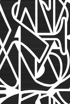
The Idea
The evolution of the library in the Information Age inspired the approach. The utility requirements drove the design process. Mixing all the alphabet characters into a single sign identifies knowledge, and a wave pattern evokes a sense of technology. The utility requirement was met by calculating an algorithm to get the required 40% blocking of light by alternating positive and negative stripes across the alphabet design. Ultimately, the fritted glass graphics extended the linear energy of the architectural look and feel infused throughout the materiality and spatial experience of the building.
The Final Product
The project received several awards for its design, including the Preservation Houston Good Brick Award. The library is known for retaining its mid-century modern character while being revitalized as an inviting learning commons.
The fritted glass pattern design significantly enhanced the experience of the San Jacinto Library as an iconic landmark. It contributed to the 33% increase in traffic and attendance as a result of the renovation. The area behind the façade glass became inhabitable due to the reduced heat and light penetration by 40%.
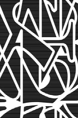
This was the extent of the brand visual language before the work MinkoImages did to boost the work environment.
What our client said about our work
The Lee Davis Library has become a welcoming place for our students to visit and study or to meet up with their study groups. This is exactly what we envisioned for this space because we know that attachment and engagement on a college campus are linked to student success.
Students reacted to the new design by posting on a library whiteboard: “This is a home, not a school.”
★★★★★
★★★★★
Karen Blankenship, MSIS
San Jacinto College library director